Robot Factory - Devlog 005
Hallo,
It’s been about three weeks since the last update, and it feels like the right time for a new one. This update is mostly focused on art & design, though I’ve also made some tweaks and fixes to the mechanics.
Even though my background is in art and animation, switching gears from coding and gameplay design back into visuals wasn’t as easy as I expected. For me, the hardest part of designing a game’s look is always the beginning — when there’s no established momentum or vibe to build from. I had a loose concept of a mechanical/electronic fungus parasitizing a living body, but the overall world’s tone was still unclear.
Since this is a 3D game, there’s always a gap between sketching ideas and seeing them in-engine (which is why I often start with Unity’s primitives when experimenting with characters). Eventually, I found a base procedural fleshy/organic texture, then edited and reshaped it into the base for the ground. I kept the albedo flat while using the texture for normals — just enough detail without overly busying up the ground. With some basic lights added, the atmosphere started coming together.
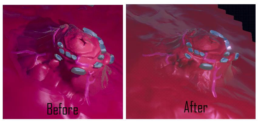
Redesigning the HQ
Once the ground felt solid, I shifted focus to the HQ (or, as I think of it, the main mushroom). I find it much easier to design a defined object — a character, a building, or a prop — than an environment, so this part was fun. Maybe a little too fun, since I had to stop myself from adding endless details. Keeping geometry limited isn’t just important for performance; extra details can also risk breaking existing functionality.
The new HQ ended up much taller than before, which caused problems with the original top-mounted arm. It was now too short for its collecting duty, and on the other hand (pun intended) reached outside the camera view. Instead of forcing it to work, I replaced it with four mechanical arms housed inside hinged side hatches. This change wasn’t just visual — it also improves gameplay. Collectors can now return to whichever hatch is closest, letting the HQ snatch resources from all sides like a greedy monolith. The top hatch will be kept for a future function.
Because the floor is now fleshy tissue, the HQ couldn’t just “stand” on it — it had to emerge from it. This is partly why the new version is taller, with its base covered in quivering flesh. That looked good, but it broke the system for attaching connectors to the HQ. The solution was three tubes that pierce through the fleshy base and act as sockets, each with a visual indicator that appears when placing connectors.
I also used the opportunity to tweak the animations of robots emerging from the HQ and added safeguards so idle robots no longer block the deployment area (writing an algorithm for parking robots was fun!)
Resource Spawners & Shader Struggles
Next, I tackled resource spawning, since having resources just pop in randomly was never meant to last. I designed and animated fleshy mounds that grow from the ground and spit out resources. They still look somewhat phallic — though believe it or not, the first version was even more suggestive.
The hard part was blending them (and the HQ base) into the ground. Without it, there were ugly seams where they met. The ground's normals were especially problematic, since they never quite lined up. This forced me into shader graph territory — not my comfort zone.
My first attempt was to give each object a semi-transparent “skirt” that overlapped the ground, blurring the seam. It kinda worked visually, but introduced rendering issues. Worse, WebGL builds don’t play nice with transparency, so the skirts simply vanished online.
After wasting a whole day fiddling with settings, I pivoted: alpha clipping with dithering. This lets me fake gradual transparency while keeping things WebGL-friendly. I also added a general dithering effect for a retro-ish look.
Syncing normals with the dithering was trickier — fine for flat objects, but upward protrusions looked wrong. Eventually I ditched the skirts entirely and applied dithering directly to the bases of objects. After some shader wrestling, it worked! It not only looked better than my original approach but also cut unnecessary geometry and worked perfectly in WebGL.
Below is a demonstration of the two versions of connecting the flesh mound to the fleshy ground.
Smaller Changes
I also gave the robots (collector and turret) a small visual upgrade to make them less boxy. That meant adjusting some animation clips, but compared to the shader headaches it was easy. Lastly I revamped the fog of war so that it now actually hides elements, and isn't just a flat black overlay. This will probably be further adjusted in future updates.
That’s a good place to wrap things up. There’s more to cover, but this post is already long enough.
As always, feedback and critiques are welcome!
— Zach
Leave a comment
Log in with itch.io to leave a comment.